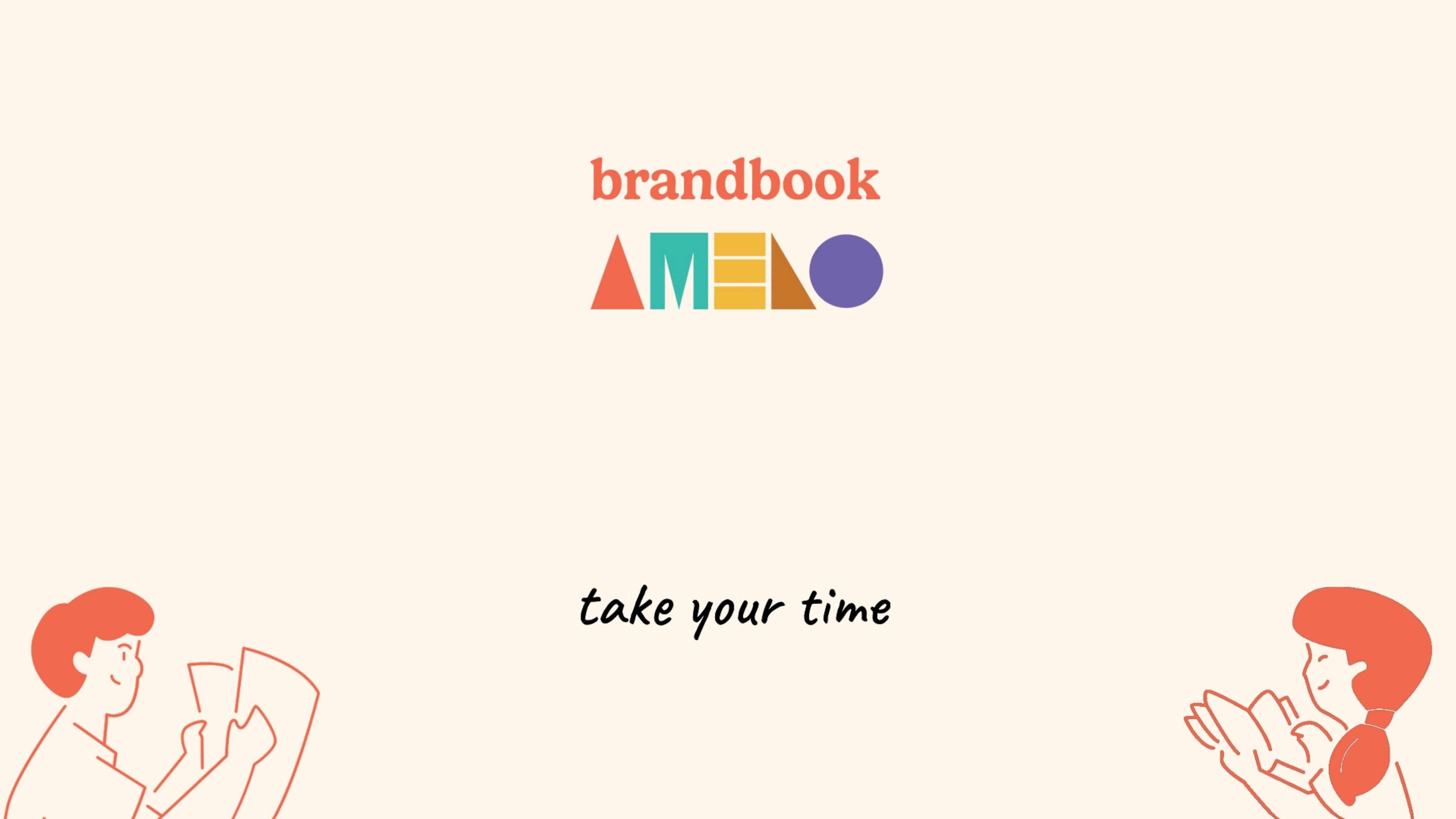
Amelo, a coffee shop brand built on one idea: take your time.
Amelo is set to launch as a chain of cafés, with the first location opening soon, bringing together coffee, brunch and, in select locations, co-working. The brief from the client was simple: specialty-quality coffee at a lower price than typical specialty coffee shops. From that starting point, the archetype, the visual identity and the full brand system were built from scratch for this project.
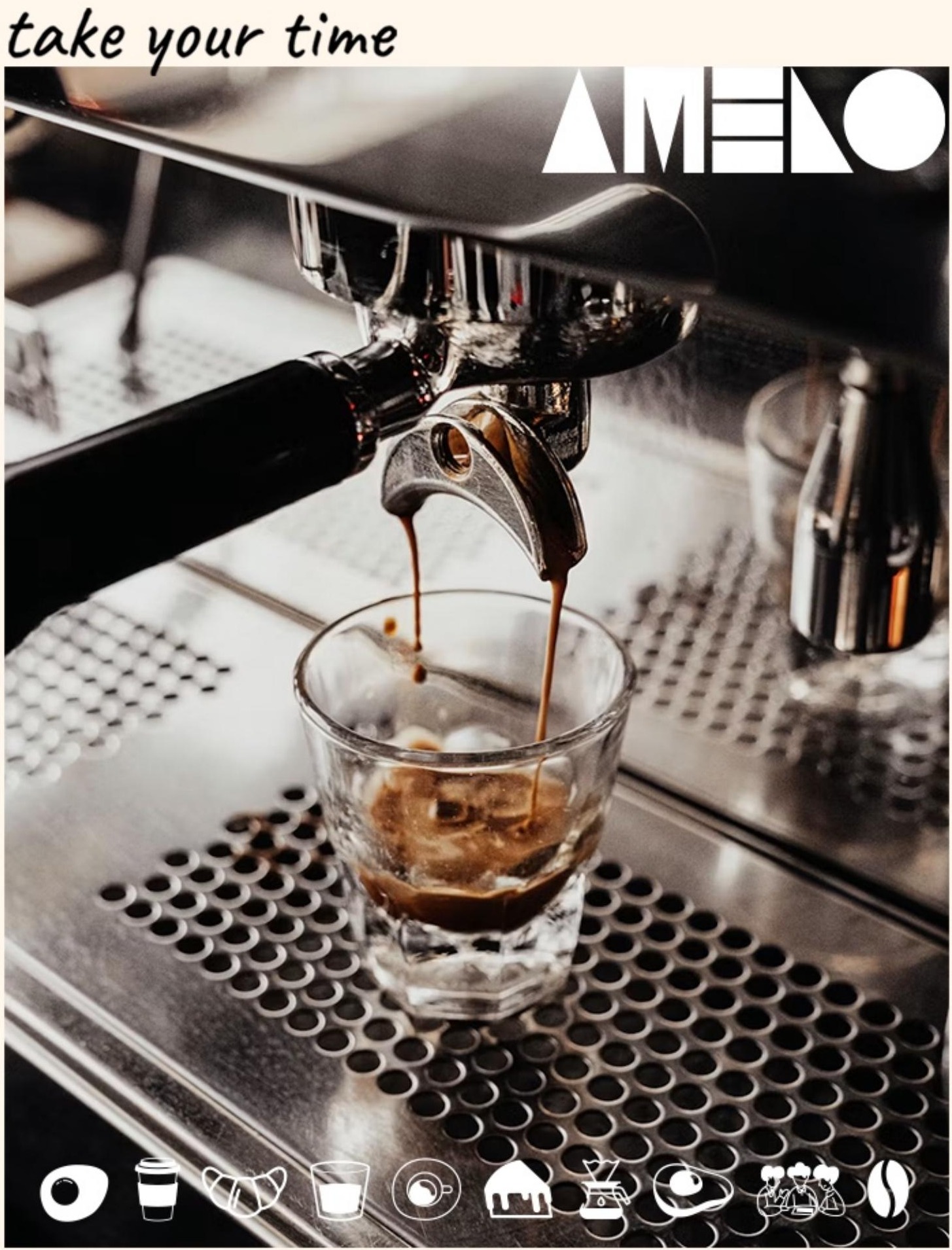
Amelo brandbook, cover spread: coffee shot with the logo and product-category icon set.
01 · About
A space to socialise, not a destination for special occasions
Amelo is a place to socialise: to drink a coffee or a lemonade, eat a brunch or a cheesecake, or simply work on a laptop for a few hours. The proposition is deliberately unglamorous: good coffee and quality food at fair prices, not luxury pricing dressed up as craft.
That single decision, quality without the premium markup, became the strategic backbone of the entire identity. Every visual choice that followed had to protect that sense of accessibility: playful rather than polished, warm rather than minimal, approachable rather than curated.
Honesty, accessibility, and a comfortable, no-pretence atmosphere: the same welcome for a quick espresso and a four-hour laptop session.
Serve specialty-quality coffee and food at fair prices, and give people back a place where the time they spend is genuinely their own.
02 · Slogan & archetype
"Take your time" is a design instruction, not just a tagline
The slogan captures what the brand actually sells: the time spent at Amelo belongs to the customer, whether they're meeting a friend, reading, thinking, or working. Rather than sitting quietly next to the logo, the phrase is treated as a recurring visual device, printed in a loose, handwritten script across packaging, signage and social posts, and repeated in every accent colour of the palette.
take your timetake your timetake your timetake your timetake your timetake your time
Brand archetype
The Regular Guy
The Regular Guy is the archetype of belonging: it doesn't want to stand out, it wants people to feel like they're among their own. It believes good things shouldn't need to be exclusive to be good, which is precisely the territory specialty coffee tends to abandon in favour of expert vocabulary and curated atmosphere.
For Amelo, that translates into a brand that talks like a person, not a menu: warm humour instead of superior irony, the same welcome for the espresso-and-go customer as for the one camped out with a laptop for the afternoon.
Desire
Connection: the feeling of "this is my place."
Fear
Being excluded, or coming across as pretentious.
Strategy
Honesty, accessibility, unforced behaviour.
Gift
Realism, empathy, zero pretence.
03 · Logo
Five shapes, one word, built to travel
The wordmark is constructed entirely from five geometric shapes (a triangle, an "M" bar, a rectangle stack, a right triangle and a circle) spelling AMELO without a single traditional letterform beyond the M. Each shape carries a category colour, so the mark itself becomes a small legend for the brand's colour system.
Primary lockups: full colour for own materials, solid coral or reversed white when the mark needs to sit quietly on a busy layout.
Full colour
Carries every category colour at once. The default lockup for the brand's own materials and packaging.
Solid coral / reversed
Used on grey, white or coral backgrounds where contrast (not colour storytelling) is the priority.
Category colour
The whole mark switches to one secondary colour when communicating specifically about food, drinks or co-working.
Safe space
Clearance around the logo is measured using the width of the letter "A", simple to apply consistently across any format.
Versatility
For partnerships and events, the shapes can be filled with contextual imagery (a film reel for a TIFF partnership, for instance) while staying instantly recognisable.
What to avoid
No stretching or skewing, no low-contrast placement, and never on a background that matches one of the logo's own shape colours.
04 · Brand colours
A warm base, with one colour per category
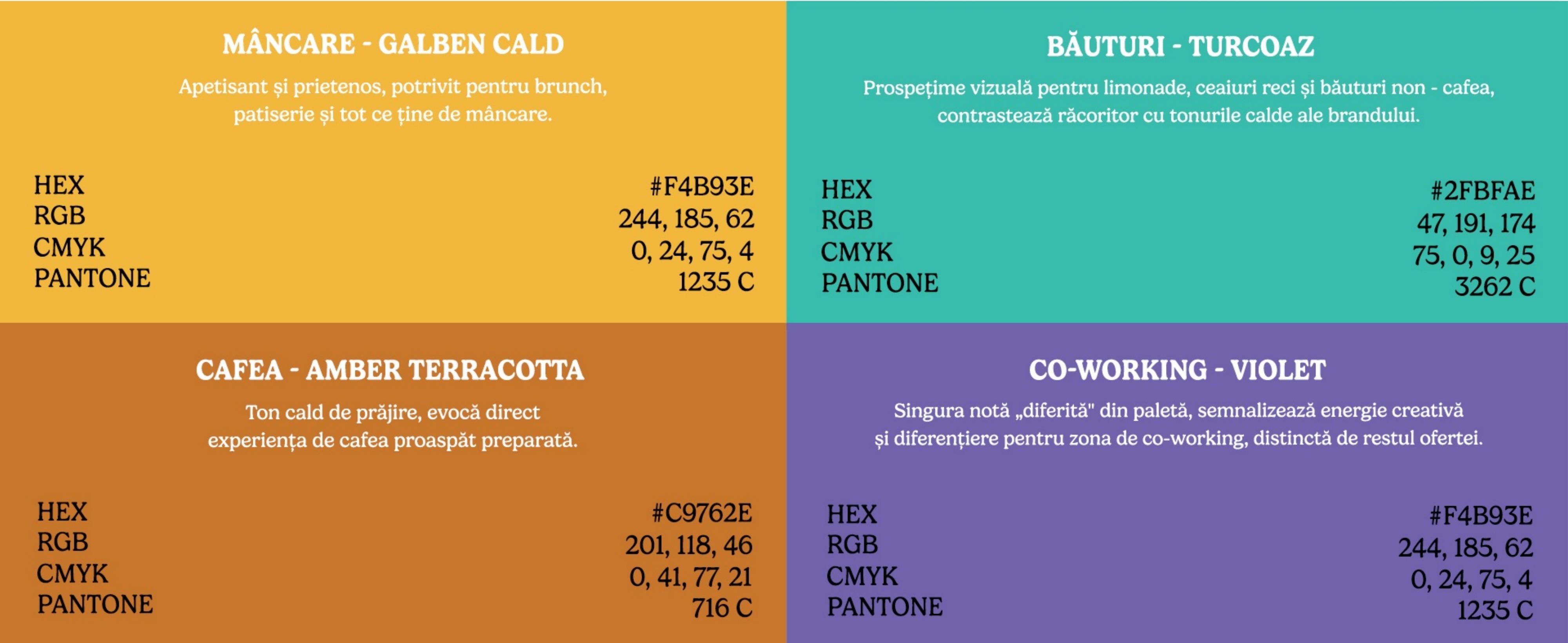
Four core colours carry the brand: a warm cream replaces stark white as the default background, coral is reserved for headlines and accents, and espresso brown stands in for pure black. On top of that, four secondary colours each take over as the dominant colour only when the brand is speaking specifically about one category: food, drinks, coffee or co-working.
Cream off-white
#FFF7EC · background
Coral
#FF6B4A · signature colour
Dark espresso brown
#2B241F · replaces black
White
#FFFFFF · small contrast details
Food, warm yellow
#F4B93E
Brunch, pastry, anything to eat.
Drinks, turquoise
#2FBFAE
Lemonades, iced teas, non-coffee drinks.
Coffee, amber terracotta
#C9762E
The roast itself, front and centre.
Co-working, violet
#8C7FC4
The one deliberately different note in the palette.
Secondary colours combine with the primary palette (they never replace it) and take the lead only when a message is specifically about their category.
05 · Icons & characters
A visual language for the menu, and for the people at the table
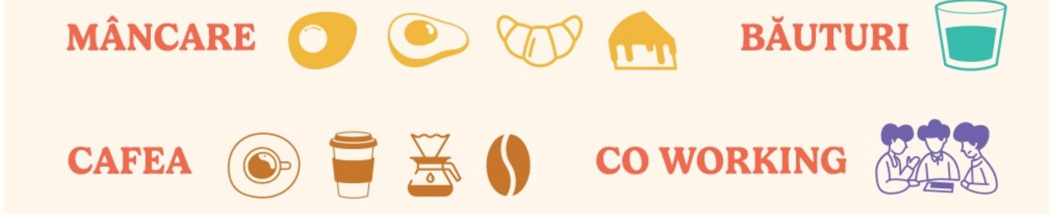
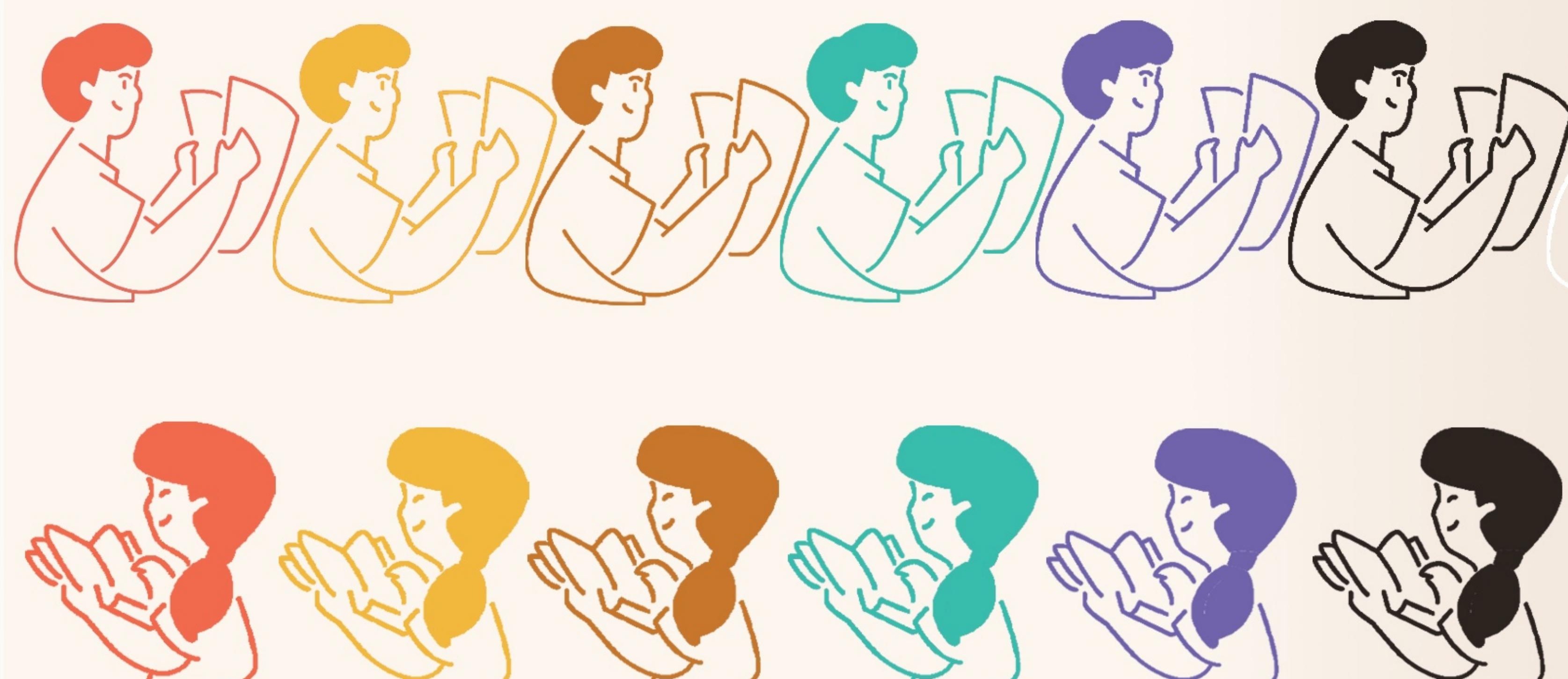
Nine simple line icons cover the brand's product categories: pastry, eggs, croissant, cold drink, espresso, the café itself, pour-over, coffee beans, and the co-working group. Alongside them, a set of illustrated characters, drawn in every accent colour of the palette, embody the "take your time" idea directly: people mid-conversation, unhurried, genuinely present.
Category icons: used large as standalone illustrations or small as menu markers.Recurring characters, always in a brand colour, never in a literal, full-colour illustration style.
06 · Typography
One typeface, carrying every weight of the brand's voice
Gelica runs across the entire system, from headlines to fine print, in weights from Extra Light to Black. Rather than mixing typefaces for hierarchy, Amelo uses weight and case: bold or semibold for section titles, medium for subtitles, regular for body copy, sentence case throughout, with all-caps reserved for short, high-impact moments.
Gelica Regular: paragraphs, descriptions, explanatory copy, kept above 11px for legibility in print.
07 · Branding in the wild
From the storefront sign to the barista's t-shirt
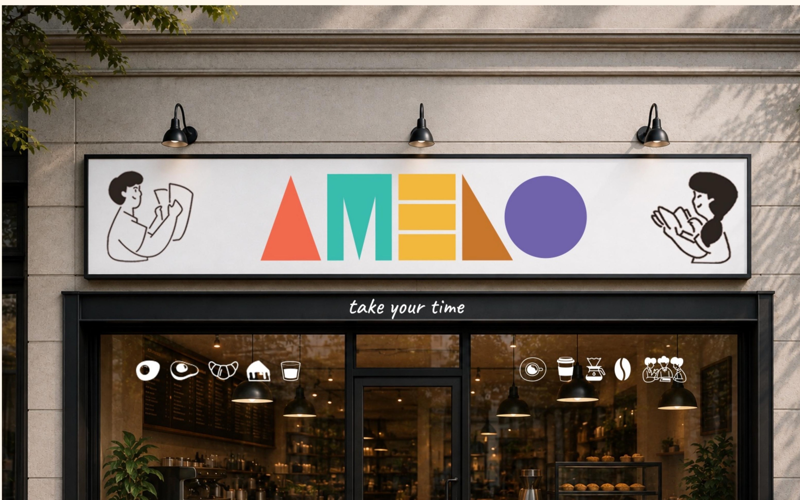
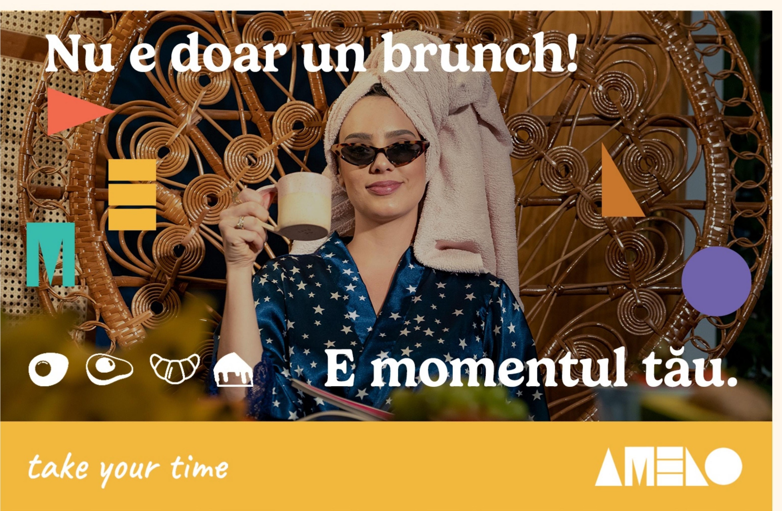
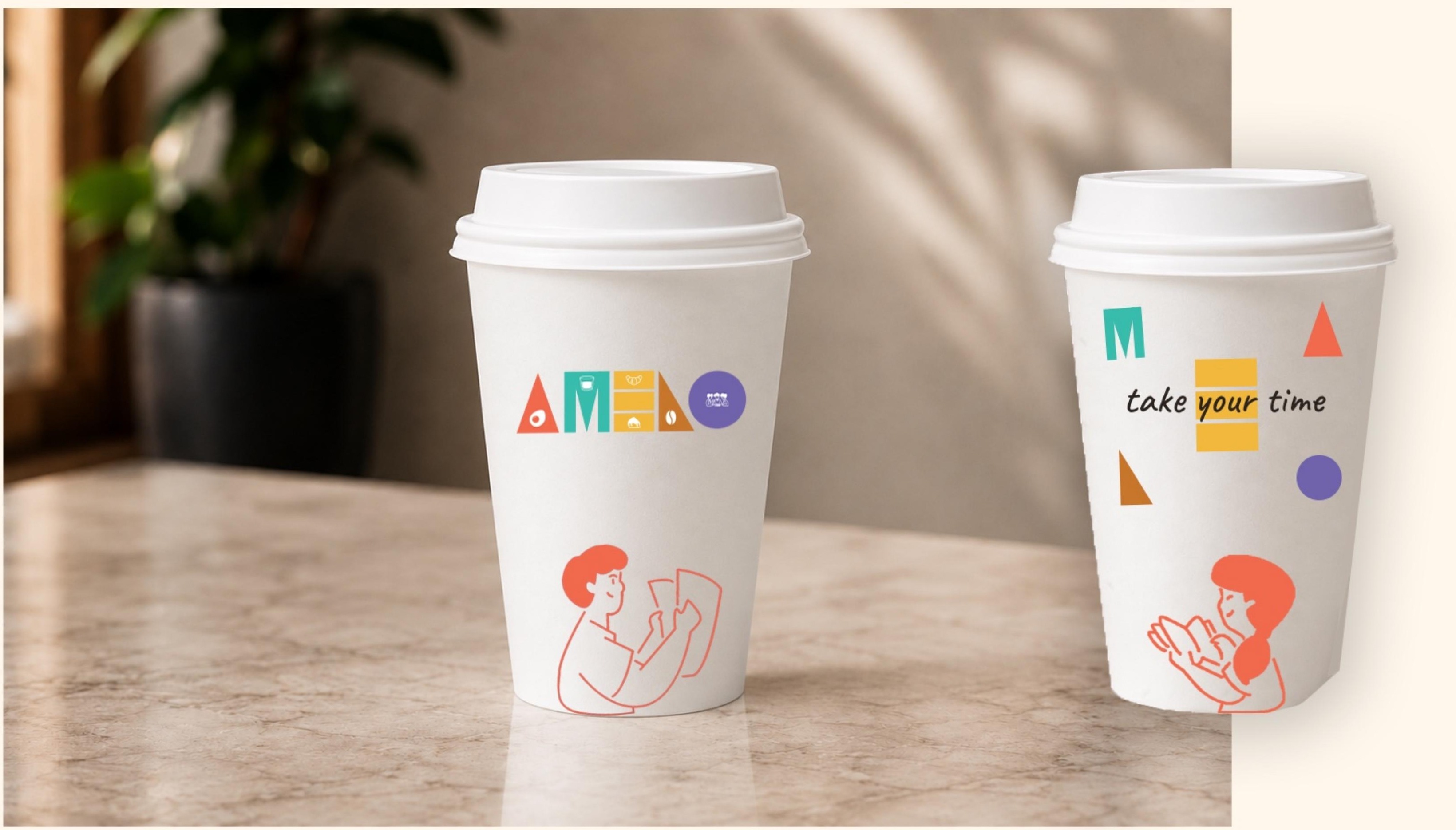
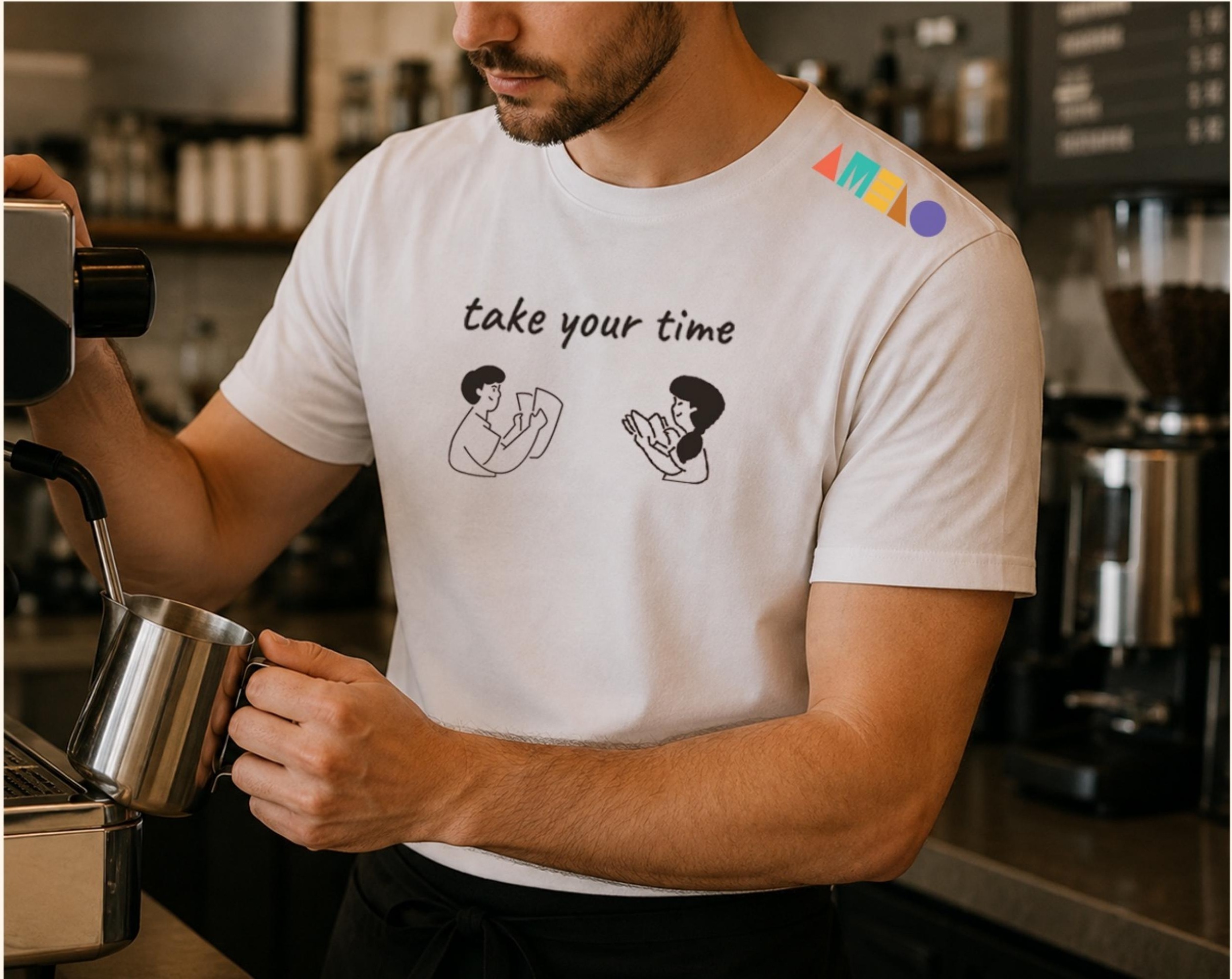
The system was built to hold up across a full range of physical and digital touchpoints (social posts, storefront signage, packaging and staff uniforms) without losing the same warm, unhurried tone anywhere it lands.
Storefront signage: the full lockup with slogan, applied at entrance scale.
Social post: brand shapes and icons used as scattered accent elements over lifestyle photography.
To-go cups: two lockup variants, full logo vs. loose scattered elements.
Staff uniform: a small shoulder logo and the slogan carried onto the barista's own t-shirt.
08 · Full brand manual
Every page of the brandbook, in one place
The sections above walk through the thinking behind each part of the system. For anyone who wants the complete reference (spacing rules, colour codes, do's and don'ts and every applied example) here's the full 22-page brand manual, page by page.
Page 1 / 22Use the arrows, or the ← → keys, to browse
Reflection
The best identity systems are simple enough to survive contact with a busy café floor.
What makes Amelo work isn't a clever wordmark on its own: it's that the archetype, the slogan and the colour logic all point in the same direction, so a barista's t-shirt, a to-go cup and a storefront sign all read as the same unmistakable brand, without anyone needing a style guide in hand to get it right.